

Philanthropy at Scale: 48in48 Hackathons
Rapid web design for global non-profits
Overview
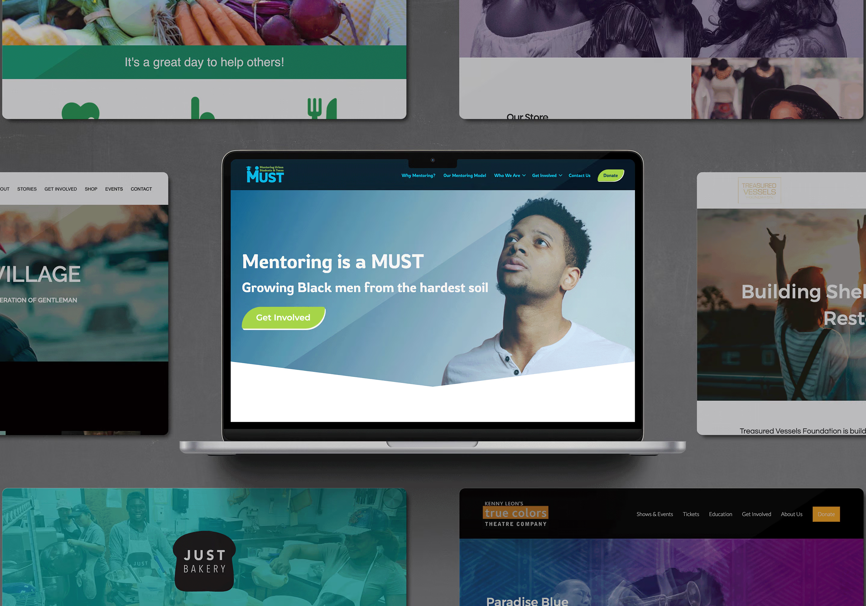
48in48 is a global non-profit organization that hosts hackathon-style events to build 48 websites for 48 non-profits in exactly 48hours.
Over the course of several years and multiple events, I volunteered my UX and design expertise to empower organizations with professional, accessible digital platforms that amplify their missions.
Role
Team
Scope
Designing against the clock
The challenge of a 48in48 event is unparalleled: you are matched with a non-profit on Friday evening and must deliver a fully functional, branded, and accessible website by Sunday night. This requires ruthless prioritization, rapid decision-making, and the ability to immediately translate a non-profit's core mission into a clear digital architecture and visual identity.
Empowering
communities
Across physical events in Atlanta and Dallas, as well as global virtual events, I helped launch digital homes for organizations spanning healthcare, the arts, and youth advocacy.
Events I've participated in and my role:
Atlanta 2018 ✦ Oct 12–14 ✦ Designer & site builder
Super Service Event 2019 ✦ Jan 25-27 ✦ Designer & site builder for 2 teams
Atlanta 2019 ✦ Oct 4-6 ✦ City Project Officer + designer & site builder
Dallas 2019 ✦ Oct 18-20 ✦ City Project Officer + designer & site builder
Global Build Event 2020 ✦ Oct 2-4 ✦ Designer & site builder
Women's Build Event 2021 ✦ Apr 9-11 ✦ Designer & site builder
Event awards for sites I worked on:
I'm a Father F1rst, Inc: 3rd place overall for the Atlanta 2019 event
Just Bakery: 2nd place overall for the Dallas 2019 event
Some of the non-profits I've helped:
National Coalition of 100 Black Women, Inc
Project UFirst
Ray of Hope Foundation
I'm a Father F1rst, Inc
FashionKind Foundation
Feeding GA Families
Treasured Vessels
Mentoring Urban Students & Teens (MUST)
Granby Play Days Daycare
Kenny Leon's True Colors Theatre Company
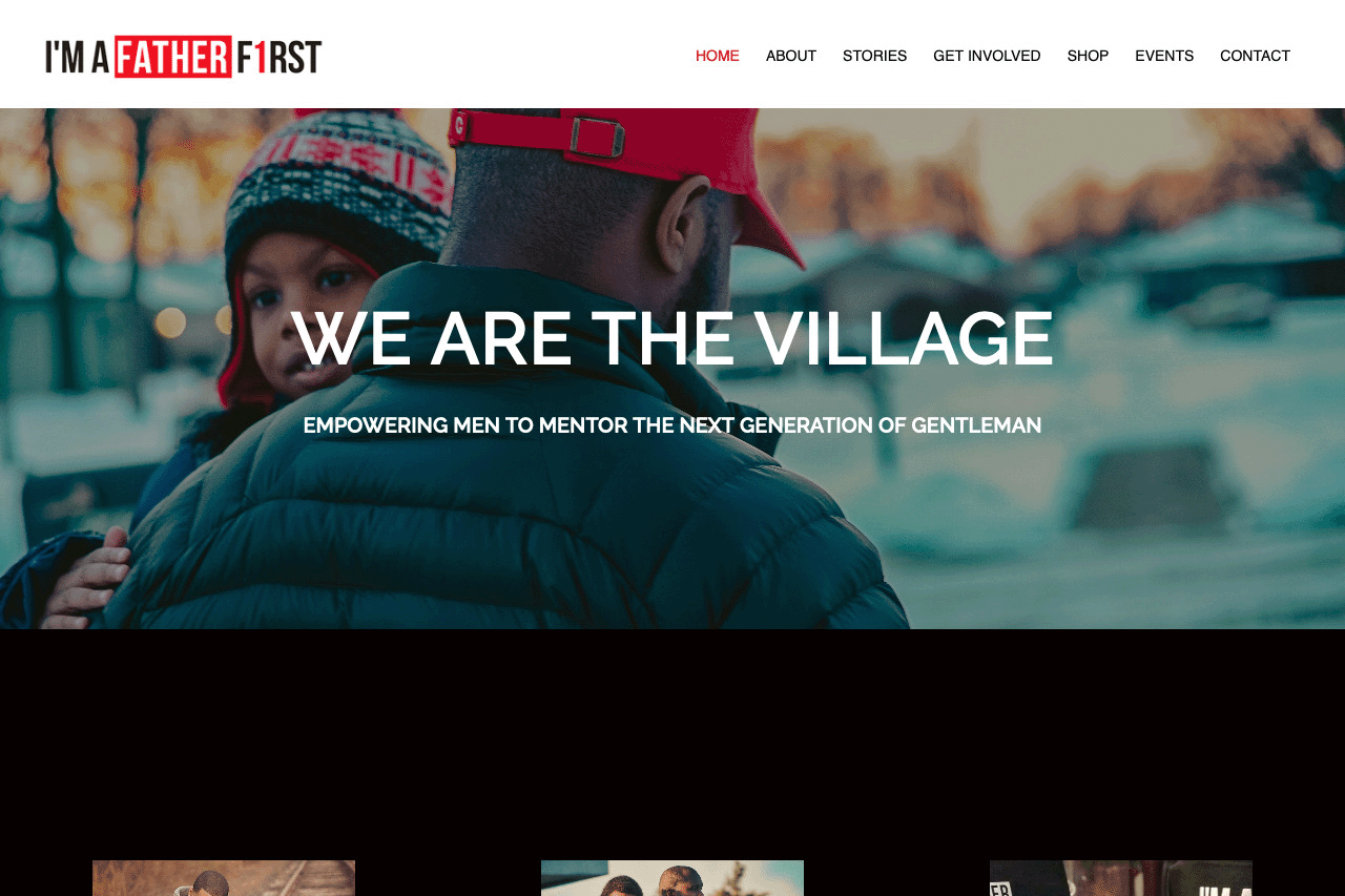
I’m a Father F1rst, Inc is an Atlanta-based nonprofit whose mission is “empowering men to mentor the next generation of gentlemen.” They wanted a website that conveyed their message clearly and allows users to easily get involved or make a donation. They also have a small online store that needed to be set up in their new website. I selected imagery, iconography, fonts, and colors that aligned to their brand strategy and mission. This site won 3rd place overall for the Atlanta event.
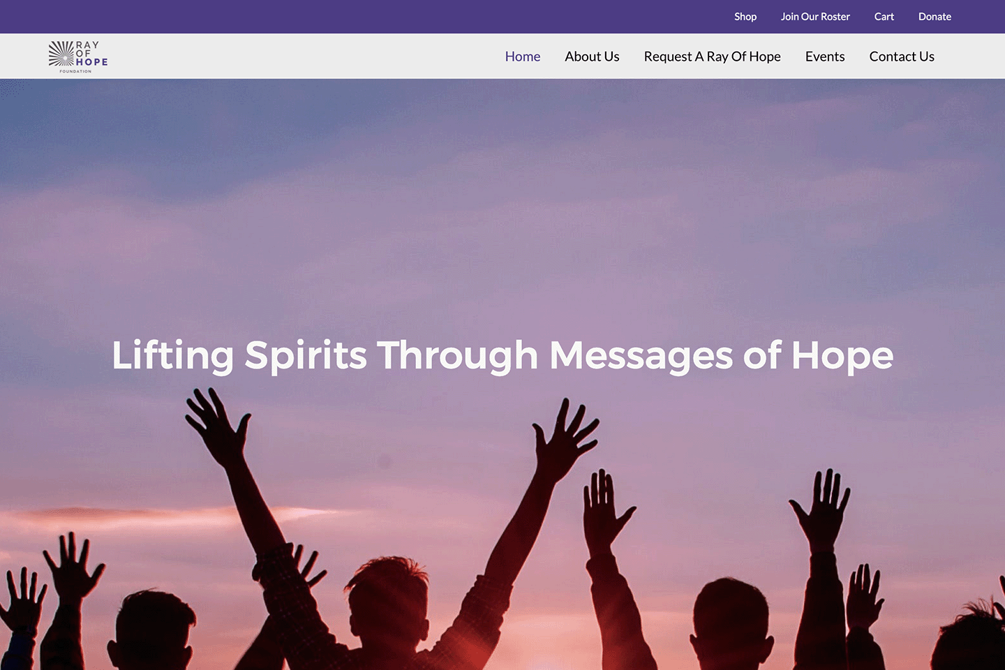
The Ray of Hope Foundation tasked us with updating their site to convey a positive message and easily allow users to get involved or contact them. We incorporated their brand colors and fonts throughout the site and selected imagery that fit in with their brand strategy and message. The result was a clean, welcoming site that the nonprofit loved.
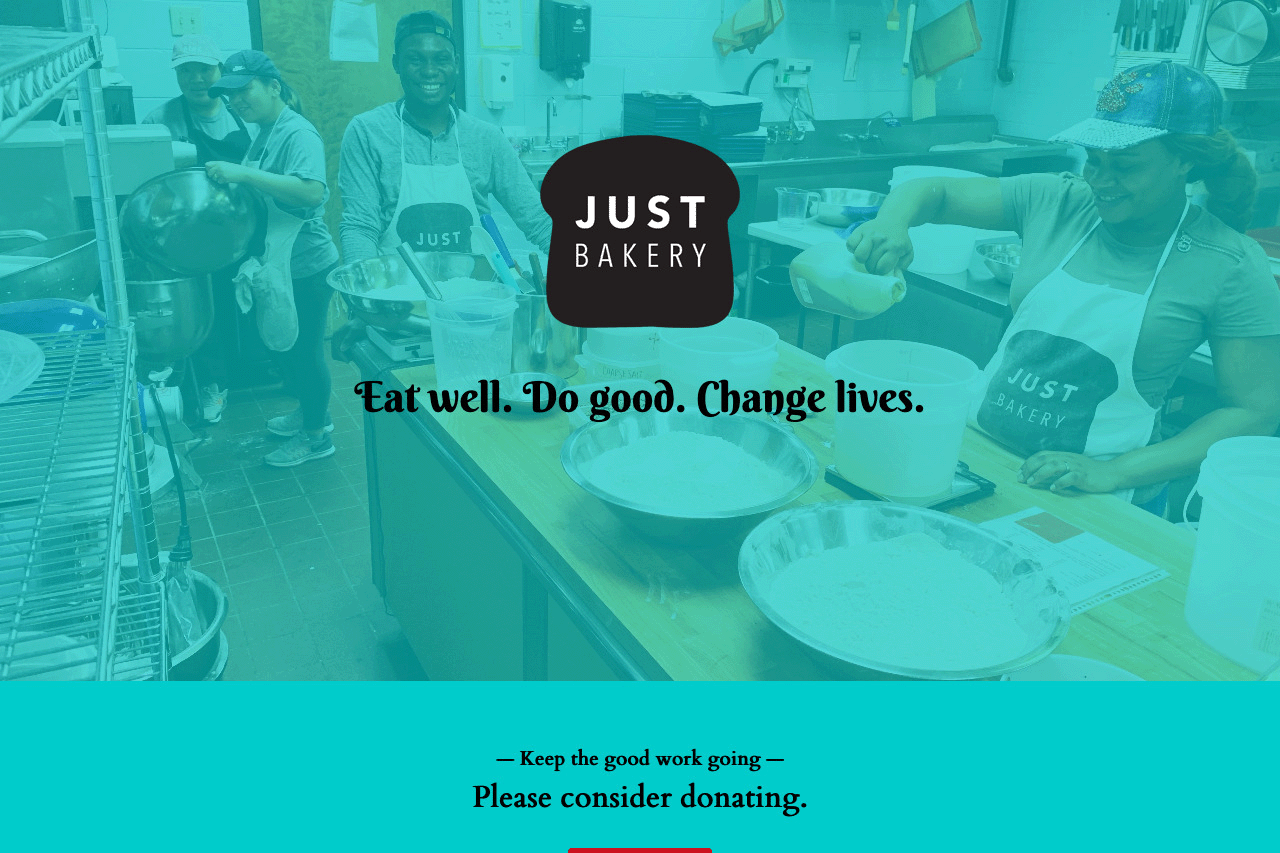
For Just Bakery, we designed and developed a warm, mission-driven website. We utilized a striking teal color overlay to modernize the visual hierarchy, keeping the immediate focus on the bakery's core message of community empowerment and clear donation pathways. This site won 2nd place at the Dallas 2019 event.
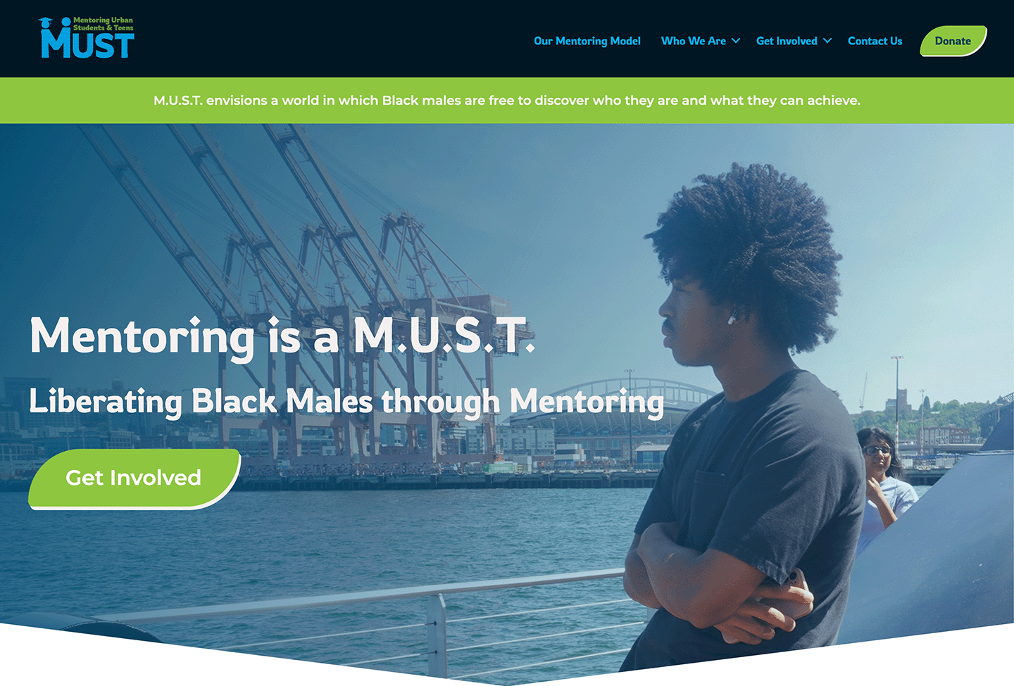
My team built a new website for MUST that conveyed their mission of the power of mentorship in empowering young black men to graduate high school and succeed in life. Imagery, colors, and fonts were selected to align to their brand strategy and message of positivity and hope.
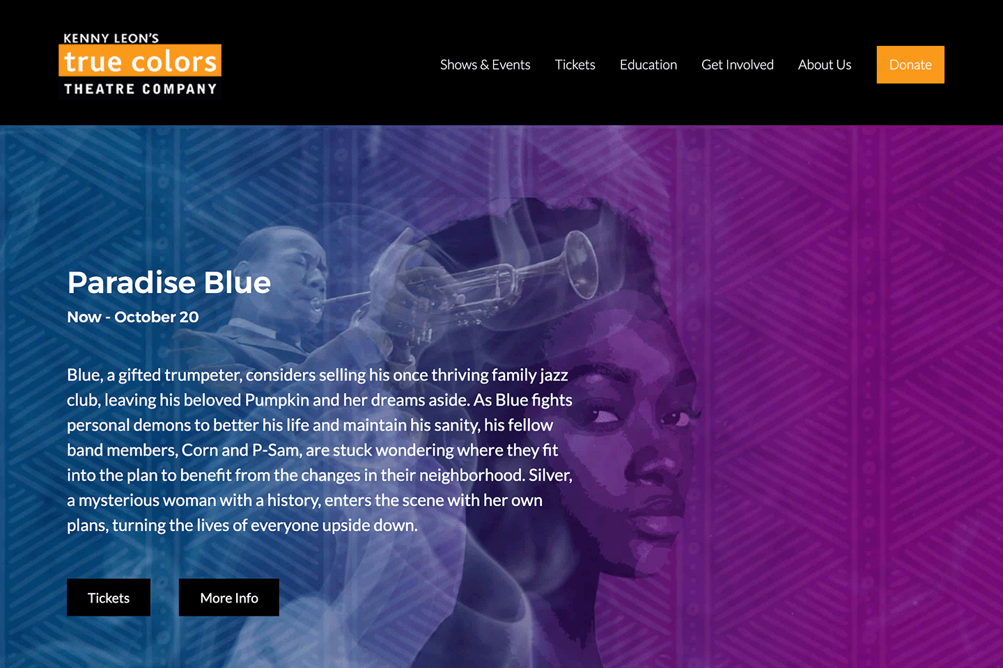
Designed a dramatic, visually rich interface to highlight current theatrical productions like Paradise Blue. The site build prioritized the user flow for ticket purchases and event details, utilizing deep, vibrant brand colors to capture the energy of the stage.
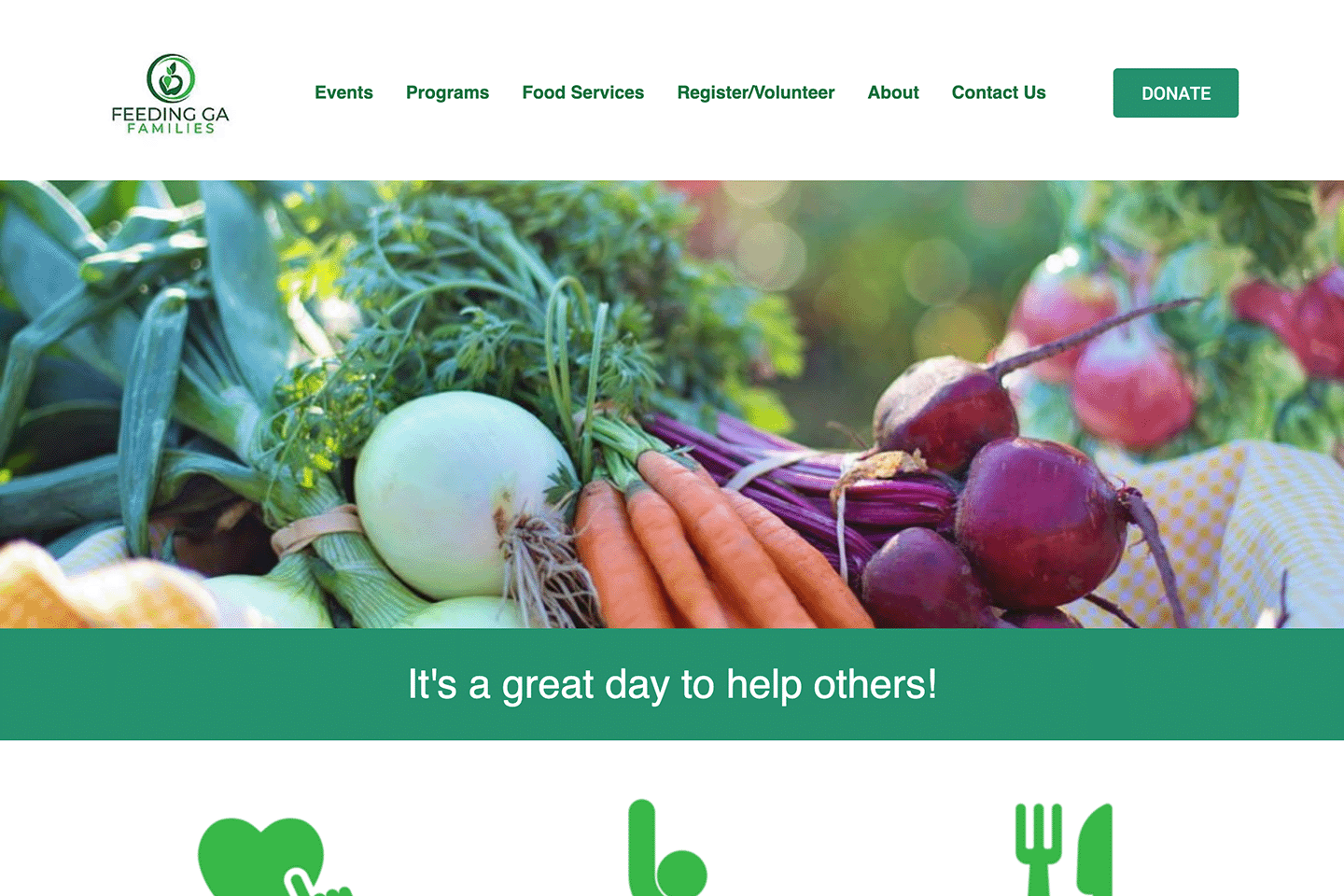
Collaborated with a team of four to design and build a responsive site focused on community impact. Designed a vibrant, produce-forward hero section with clear, accessible navigation to streamline volunteer registration, food service information, and donations.
Empowering an inclusive visual identity: inaugural Women's Build Event (2021)
Beyond the core initiative of designing and launching websites, I had the incredible opportunity to define the visual narrative for 48in48's first-ever Women's Build Event in 2021. This mandate encompassed crafting a distinct event logo, supporting graphics, and impactful t-shirt designs that would resonate with participants and authentically represent the event's groundbreaking spirit.
Power & representation
The visual identity needed to balance unapologetic feminine strength with genuine diversity. I designed the core logo and supporting graphics using bold typography and inclusive illustrations, ensuring women of all backgrounds felt celebrated as powerful builders and leaders, rather than just participants.
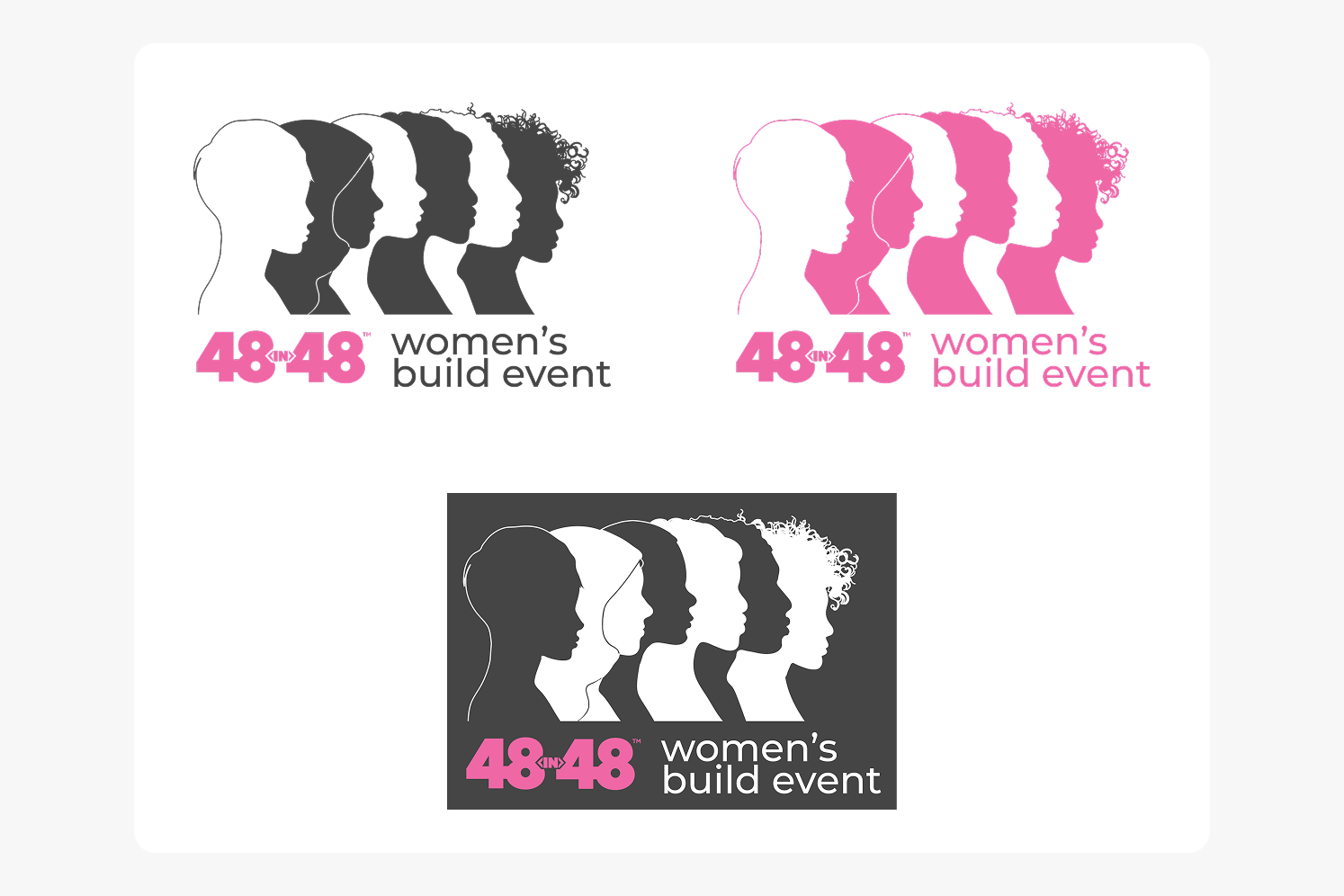
Wearable community
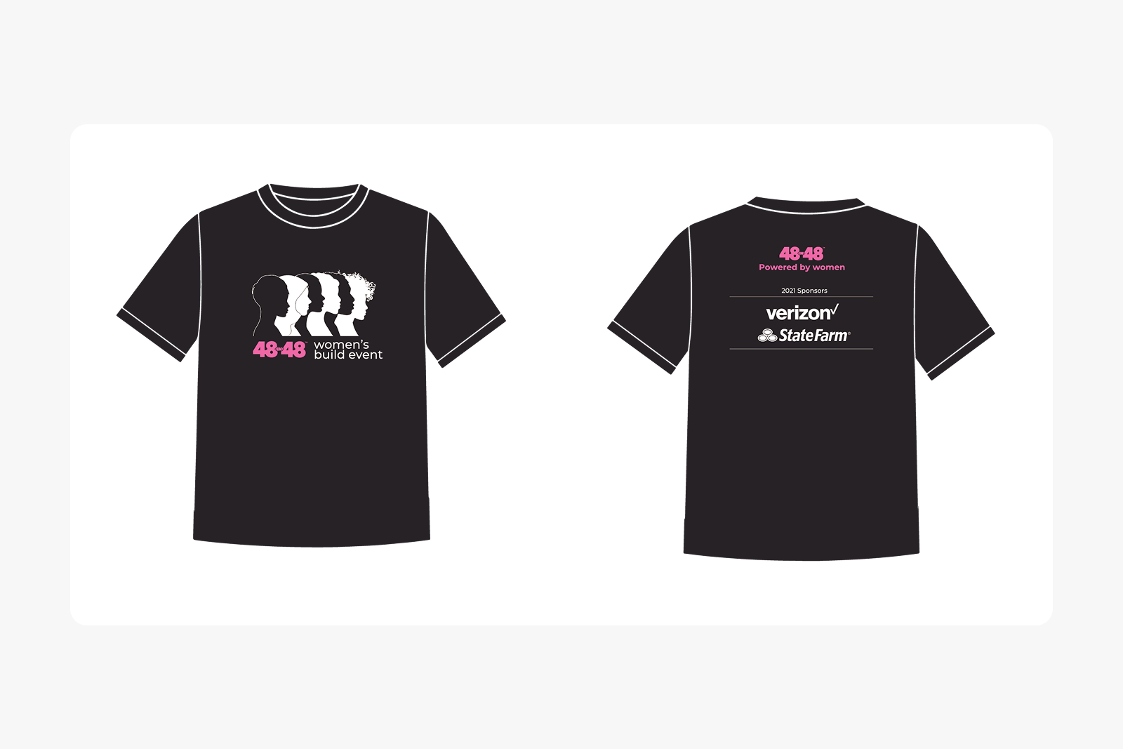
I translated the branding into cohesive front-and-back t-shirt graphics that served as a tangible symbol of unity for the event. By pairing the bold primary logo on the front with an extended visual narrative on the back, the apparel successfully unified the volunteers under a shared, empowering identity.
Agility and purpose
Participating in these events sharpened my ability to bypass over-thinking and trust my design instincts. It reinforced the importance of accessible design—ensuring thesenon-profits could reach the communities that needed them most—while providing me with a deeply rewarding way to leverage my enterprise UX skills for community good.