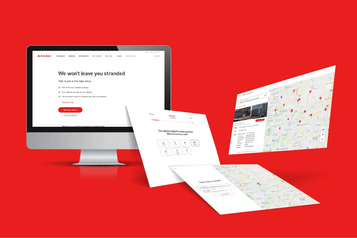
Emergency Roadside Services
Transforming crisis into calm

Overview
Reducing cognitive load for stranded drivers through radical empathy and system-level design.
As the Lead UX Designer for Emergency Roadside Servcies (ERS), I owned the end-to-end UX lifecycle, leading the team through strategy, benchmarking, and architecture to high-fidelity design and prototyping.
✶ 192% increase in completion rates
✶ >90% CSAT score
✶ <48hr optimization cycle
🔗 State Farm Emergency Roadside Services
Role
Team
Scope
Anxiety & abandonment
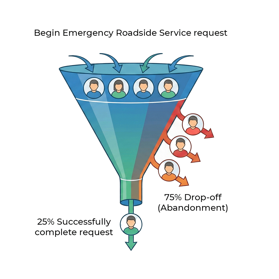
When a customer needsroadside assistance, they are inherently in a state of crisis—often stranded,stressed, or in danger. The legacy digital ERS experience was failing these users, suffering from a staggering 75% drop-off rate. Customers were abandoning the confusing digital funnel in favor of calling the call center, indicatingthat the UI lacked the guidance, reassurance, and clarity required during an emergency.
The business needed a solution that wasn't just functional; it needed to be deeply empathetic to the user's panicked cognitive state.
Scope & constraints
The UX team partnered with our enterprise research team to baseline test the existing application and discover customer pain points. We also evaluated data and customer feedback from exit and completion surveys to find fallouts and possible pain points. Testing and data analytics revealed customers struggled, and sometimes abandoned, the original application due to a lack of guidance, assistance, and clarity. In total we identified 17 base opportunities for improvement.
While the design iteration and validation took approximately 6 weeks to complete, development resources were not available to pick up the work for several months. As such, we were able to validate and iterate on the design, while socializing it across the Claims suite prior to development. During the development, I worked with a team of engineers in another country. This presented unique challenges during the QA process and the need to set up a full test environment.
Mapping the chaos
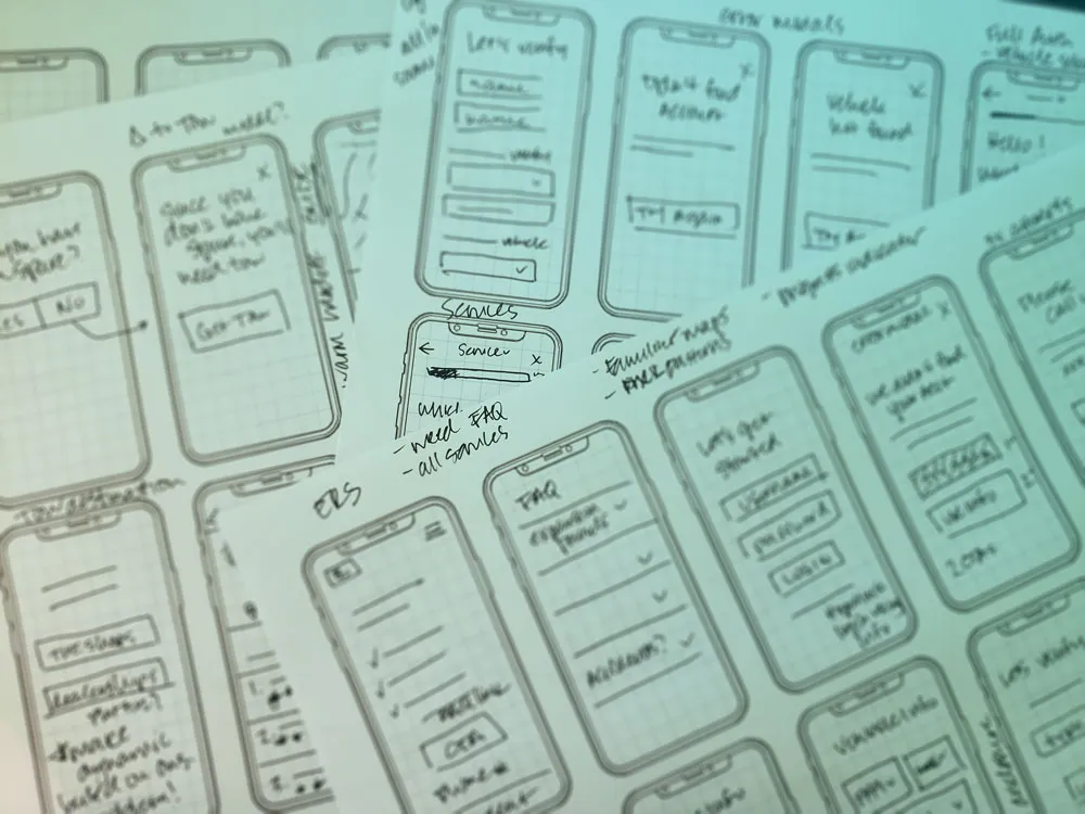
Learning the underlying dispatch workflows was vital. I couldn't just design a pretty interface; I had to understand the complex, rigid constraints of how tow trucks were actually routed and dispatched in the real world. I spent weeks whiteboarding and sketching out low-fidelity wireframes, translating dense backend operational logic into a linear, user-friendly digital intake flow that prioritized speed and simplicity.
Designing for reassurance
Every screen was designed to answer the user's most pressing question: "Is help on the way, and when will it get here?"
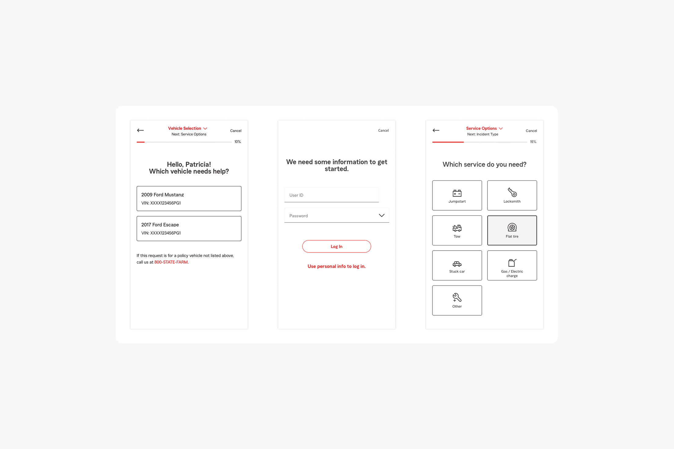
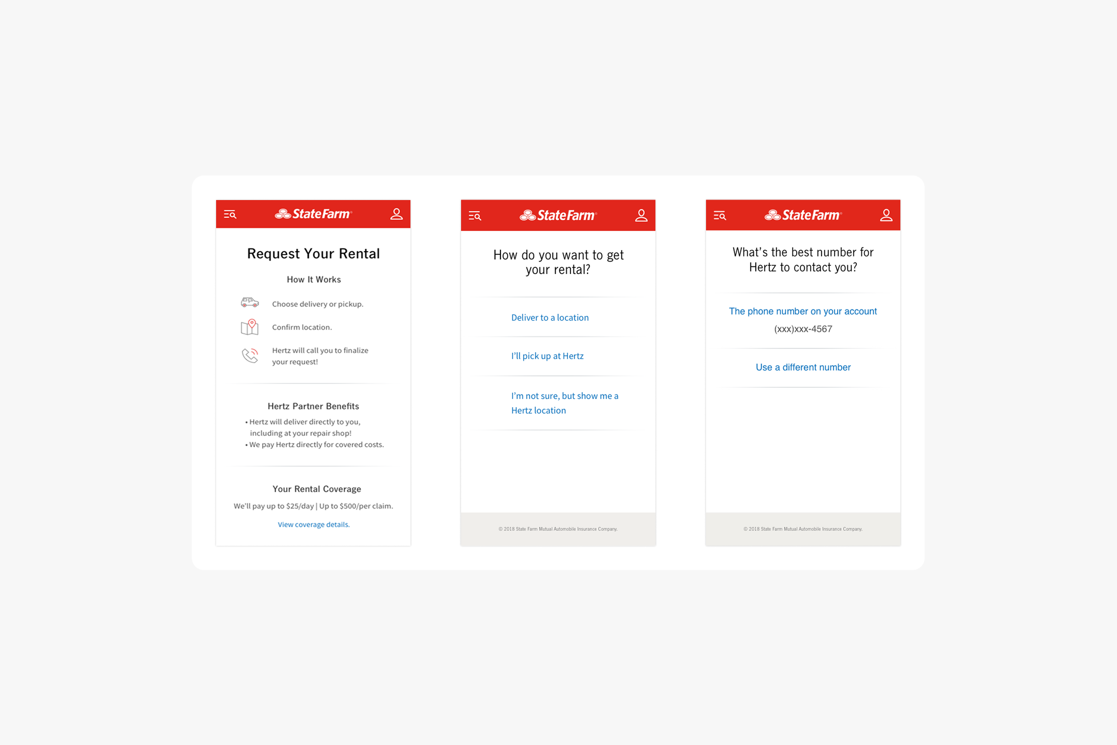
We removed the burden for users to remember their login and, instead, authenticate with familiar information. We also offered clear options each step of the way with new, consistent patterns. We reduced cognitive load by breaking the requestform into single, bite-sized questions with large, tap-friendly touch targets.
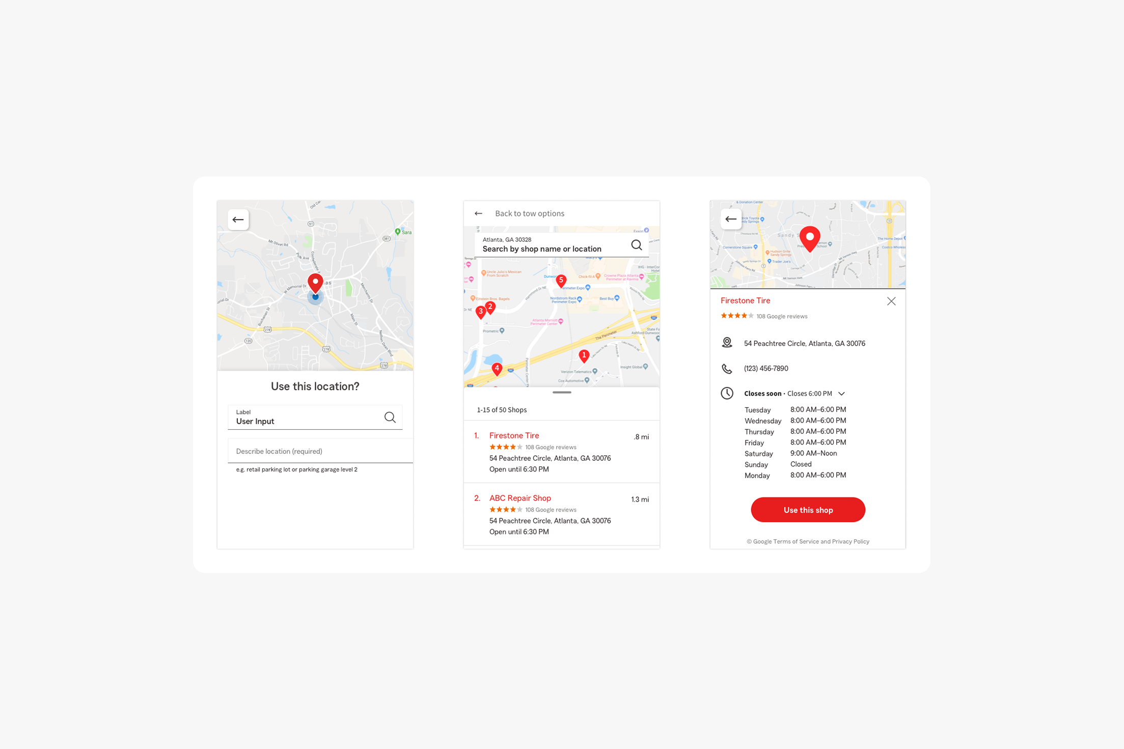
Familiar map experiences helped to lower cognitive load. These new map experiences follow interaction patterns that are familiar to customers from using services like Google or Lyft.
Pivots & post-launch realities
Throughout this project I navigated the dual challenges of a global pandemic and a mid-development rebrand for State Farm. By leveraging established remote-work practices with offshore teams and implementing a phased design update, we maintained project momentum and hit our critical release targets.
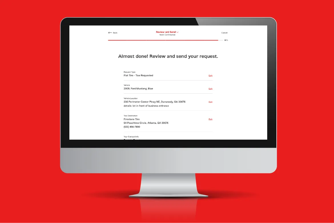
With our first release, we saw a 44% drop off rate on the review screen, even though it had tested well. We quickly implemented some changes to the content.
Within one day, our completion rates rose to 78% and the drop off rate decreased to 6% on this screen.
A guided, clear, and consistent roadside experience
Our goal was to increase our completion rate from 25% to 60%, and bring our customer satisfaction score up to 85%. We exceeded our goal in the first month with an average completion rate of 73% and a customer satisfaction score over 90%.
The resulting redesign far exceeded expectations in terms of customer experience and completion rates.